
Data Meets Creativity: The Data Art 2025 Exhibition
Welcome to the Data Art 2025 Exhibition, a celebration of creative visualisation and data-driven artistry.
The Data Art 2025 Exhibition showcases a collection of innovative, thought-provoking artworks created by third-year students as part of the Creative Visualisation module in the School of Computer Science and Engineering at Bangor University. This unique module invites students from computing disciplines to explore how data can be transformed into visual, and often emotional experiences.
Blending data science, programming, and artistic expression, students produce original works that interpret real-world data sets—from environmental and social statistics to personal and abstract narratives—using visualisation techniques and creative technologies. Each piece reflects the students' ability to question, reimagine, and present data not just as information, but as a medium for storytelling and engagement.
Rooted in the principles of authentic learning, this module challenges students to work on real projects with public impact, culminating in this public exhibition. It highlights how data can inspire creativity, raise awareness, and foster new ways of understanding our world.
Data art turns information into visual stories. It combines elements of data visualisation, digital design, and traditional art to explore ideas in creative and meaningful ways.
In this exhibition, data becomes more than numbers – it’s used as a subject, a tool, a structure, or even a spark of inspiration. These artworks show how facts and figures can be transformed into something expressive, emotional, and engaging.
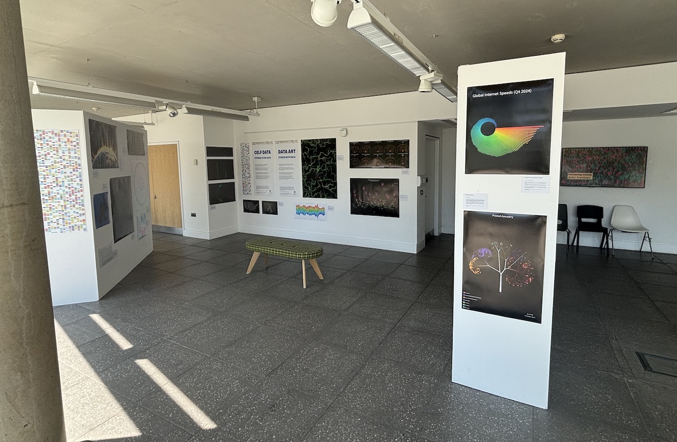
A glimpse into our Data Art exhibition – installations by students from the Creative Visualisation module.
2025 Exhibition Curation
This year's exhibit explores the fusion of data science and visual storytelling, curated by Professor Jonathan C. Roberts in collaboration with Dr Peter Butcher from Bangor University.
As part of the Creative Visualisation module at Bangor University, students studying Computer Science, Data Science, Creative Technology or Computer Science with Games create original data art pieces.
Each student selects a dataset of personal or topical interest, explores artistic inspiration from established art styles and data artists, and experiments with alternative visual concepts. After sketching out their ideas, they bring their final work to life using Processing.org – transforming data into engaging and expressive visual art.
Exhibits
Featuring a wide range of works, from F1 data, mental health, basketball shots, to popular films and intrusion detection, each piece invites the viewer to experience information in new and provocative ways.
- Formula 1’s Winning Nationalities – Mazin Al-Rawas: A global look at dominance and underdog stories in Formula 1 history.
- Branching together – Jack Bakker: A tree-based visualisation reflecting diversity in gaming demographics.
- Average Daily Ocean Temperatures – Qusai Bakro: Circular visuals show how ocean temperatures have shifted over time.
- Open-World Game Map Sizes Compared to Anglesey/Gwynedd – Connor Christy: Compares famous video game worlds to real-world geography in Wales.
- Programming Language Popularity Overtime – Ricardo De Jesus: Bubble clusters track language popularity over two decades.
- Game Genre Popularity History (1980-2025) by Radoslaw Fabian: Streamgraph showing the rise and fall of video game genres over 45 years using dataset of 12,000+ entries.
- Solar Flares – Ryan Grundy: Visualises solar flare activity wrapped around the sun using NOAA satellite data.
- Primal Ancestry – Rufus James: A stylised evolutionary tree tracing primate species and human ancestry.
- Regional Visualisation of Meteorite Landings – Benjamin R W Jones: Maps 34,000+ meteorite landings using abstract geographic distortion.
- Car Manufacturer Registrations — February 2025 by Hailey Marie Kenny: Car images visualize UK manufacturer registrations and market share via body length and wheel size.
- Global Internet Speeds (Q4 2024) – Adrian Joseph Kilgour: Circular bar graph compares internet speeds of 144 countries by size and color.
- Country’s GDP and corruption – Kacper Krawczynski: A black hole metaphor reveals how corruption affects economic output.
- Visualizing research trends done by NASA – Patryk Labuda: Timeline visualisation of NASA’s shifting research focus and economic influence.
- Personal Game Stats – Harry Lawrence: A pixelated swirl in the Rainbow Six logo shows top-played characters over time.
- Graph Cinema Balls: Genre and Rating Through Time – Cameron McFarlane: Visualises film genre popularity and ratings from 1970 onward using colourful clustered circles.
- UK Tourism Levels throughout the years – Luke Morris: Tracks UK tourism trends from 2019-2023 with line and circle sizes representing visit data.
- Shots Made By 2010’s NBA MVPs – Frederic Oliver: Scatter plots of successful field goals made by NBA MVPs during the 2010s.
- Steam Hardware Survey - PC Specs Overview – Danny O’Malley: Displays popularity of PC specs from Steam users using colour-coded cluster sizes.
- Celestial Oscars Guide – Jessica Owen: Shows Oscar winners 2000–2024 as mini star constellations per award category.
- Visualising crowd trends in cities on trains at peak times (AM vs PM) by Juwairiyah Patel: Train length and colour-coded visuals reveal passenger crowding across cities during peak times over five years.
- Reductions in Sugar Sales from Soft Drinks in the UK (2015–2018) – Morgan Pugh: Visualises the impact of the Soft Drinks Industry Levy on UK sugar sales by category.
- Data Driven Motion – Charles Leclerc’s First Win Spa – David Roberts: Abstract flow-field visualisation of telemetry data from Leclerc’s 2019 Spa F1 win.
- Healing through music therapy by Sanjana Sharma: Circles sized and coloured to show participant mood improvements through different music genres in therapy.
- Visualising Global PM10 Air Quality Through Abstract Art – Elliot Silver: Depicts global PM10 pollution levels with size and colour-coded air quality index.
- Popular Steam Titles Across Different Game Genres – Jakub Stachowiak: Network layout linking PC game titles to genres with colour-coded Bezier curves.
- The Battle with Mental Health – Lee Stoker: Space-themed clusters illustrate global effectiveness of different mental health treatments.
- Mosaic of Obesity Statistics by Kaylum Wilson: A vibrant voxel-style mosaic visualizing BMI categories across continents using colour and tile size.
Staff and PhD students:
- Happy Countries — World Happiness Data in Facial Features by Jonathan C. Roberts: Facial feature visualizations map happiness, social support, generosity, GDP, and life expectancy by country.
- Our Ruthless Connected World by Iwan Pritchard and Peter Butcher: Visualizes global cyber-attacks on a private server using IP geolocation arcs on a 3D globe.
- Student Journeys by Jonathan C. Roberts: Paper car shapes show academic progress of Bangor University students with coloured stripes representing grades.
- Contextual Navigation - Maps of the London Underground by Cameron C. Gray: Phylogram visualization of London Underground routes focused on user context and shortest paths.
- Soundscapes — Everyday sounds: opening and closing by Jonathan C. Roberts: Visualization of sound sequences from window and elevator sounds using circle sizes and time mapping.